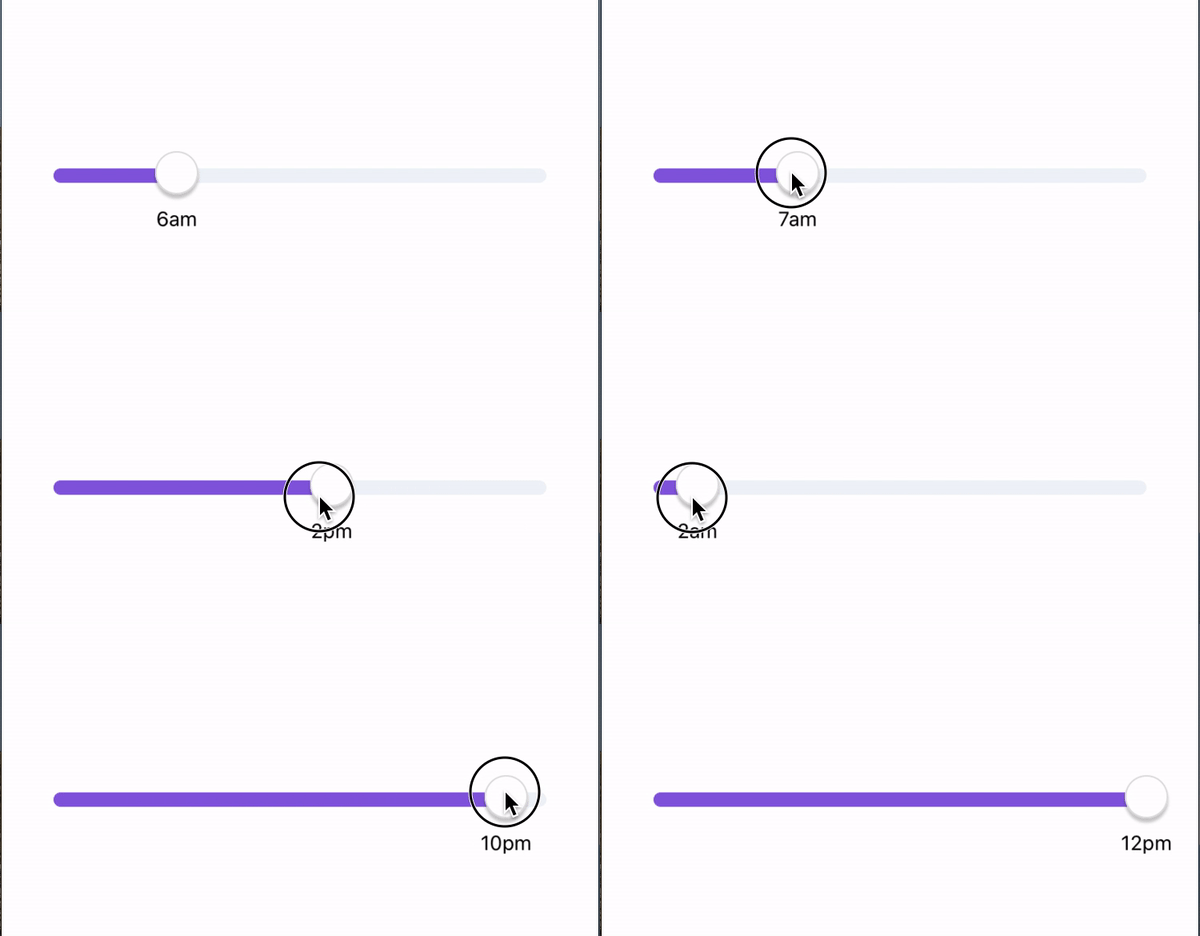
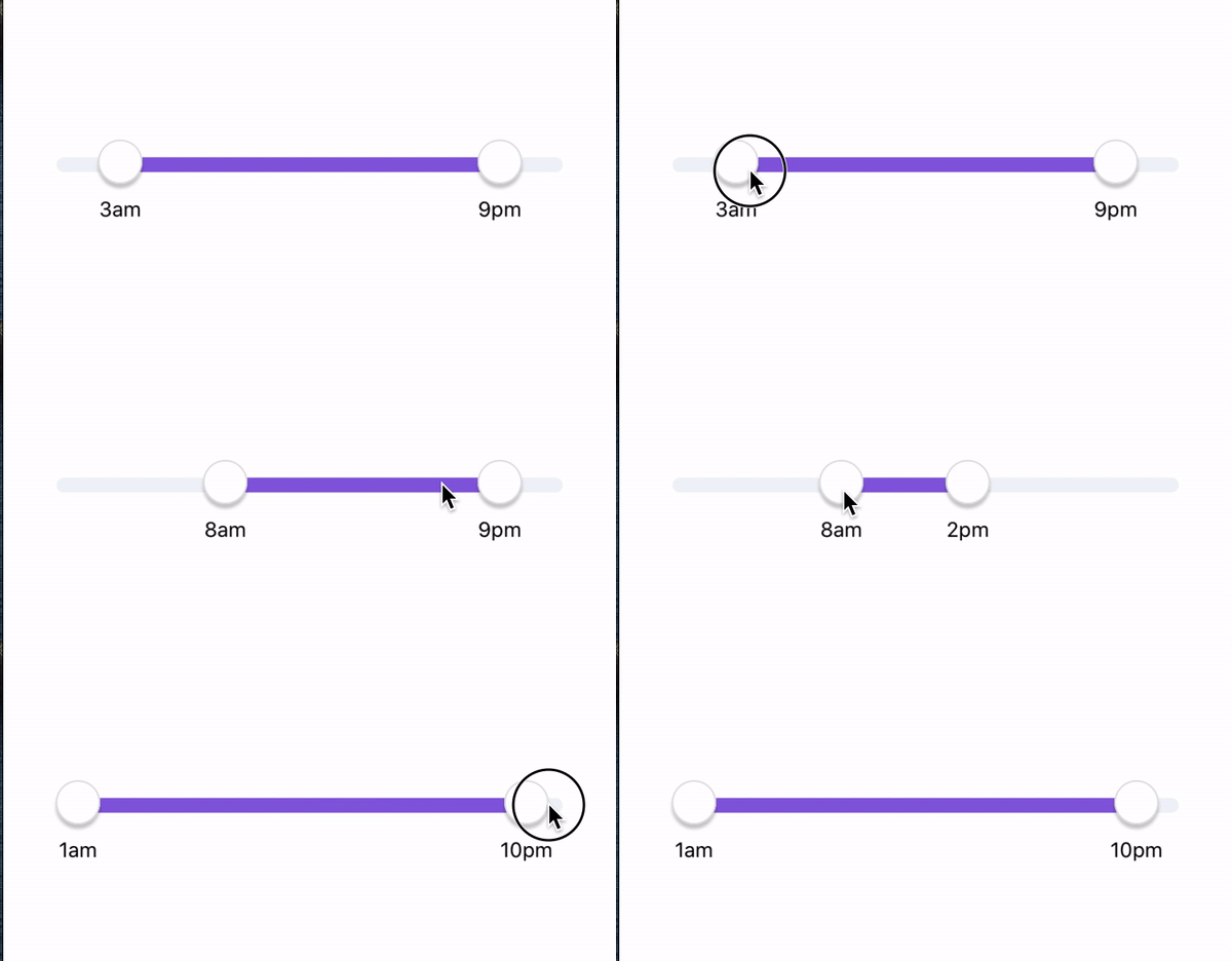
From my recent code-read, recently I have learned how to create custom time sliders. All credit goes to my colleague. I am just sharing my learning! Let us first see what do we want to make. We want to convert a slider into time sliders where users can pick a single time or a time range.


Single time slider:
First, let us set our component for this. With this snippet, we can get our init done for the slider. For our slider component, I am using the react-native-multi-slider package. With this package, you get a single slider and range slider, so it is quite good.
const TIME = {  min: 0,  max: 24 }
const SliderPad = 12;

// our time slider component
const SingleSlider = ({}) => {
  const { min, max } = TIME;
  const [width, setWidth] = useState(280);
  const [selected, setSelected] = useState(null);

  if (!selected) {
    setSelected([min]); // we are only selected min, since it is single slider
  }

  // Callbacks
  const onLayout = (event) => {
    setWidth(event.nativeEvent.layout.width - SliderPad * 2);
  };
  const onValuesChangeFinish = (values) => {
    setSelected(values);
  };

  return (
    <View onLayout={onLayout} style={styles.wrapper}>
        <MultiSlider
          min={min}
          max={max}
          allowOverlap
          values={selected}
          sliderLength={width}
          onValuesChangeFinish={onValuesChangeFinish}
          enableLabel={true}
          trackStyle={{
            height: 10,
            borderRadius: 8,
          }}
          markerOffsetY={3}
          selectedStyle={{
            backgroundColor: "#895CDF",
          }}
          unselectedStyle={{
            backgroundColor: "#EEF3F7",
          }}
        />
    </View>
  );
}
Range time slider:
Range slider is also the same except we set our values to max and min.
 if (!selected) {
    setSelected([min, max]); // we are only selected min, since it is single slider
  }
So with this our initial set up is done. We get sliders but the sliders are working as normal slider with values from 0 to 24. Now time for us to convert this into time slider.
In order for us to have custom labels, we need to pass the props customLabel in our slider. We will be making a custom label component that will do the time transformation and it will return time labels.
customLabel={SliderCustomLabel(textTransformerTimes)}
Let is now go through the most interesting part.
const width = 50;

function LabelBase(props)
{
    const { position, value } = props;

    return (
        <View
            style={[
                styles.sliderLabel, // this one is position absolute
                {
                    left: position - width / 2,
                },
            ]}>
            <Text style={styles.sliderLabelText}>{value}</Text>
        </View>
    );
}

export default function SliderCustomLabel(textTransformer: (value: number) => string)
{
    return function (props)
    {
       // these props are coming from the package
        const {
            oneMarkerValue,
            twoMarkerValue,
            oneMarkerLeftPosition,
            twoMarkerLeftPosition,
        } = props;

        return (
            <View>
                <LabelBase
                    position={oneMarkerLeftPosition}
                    value={textTransformer(oneMarkerValue)}
                />
                {twoMarkerValue ?
                    <LabelBase
                        position={twoMarkerLeftPosition}
                        value={textTransformer(twoMarkerValue)}
                    /> : null
                }
            </View>
        );
    };
}

const styles = StyleSheet.create({
    sliderLabel: {
        position: 'absolute',
        justifyContent: 'center',
        top: 30,
        width: width,
        height: width,
    },
    sliderLabelText: {
        textAlign: 'center',
        lineHeight: width,
        flex: 1,
    },
});
A bit of explanation of what is happening here.
- SliderCustomLabel is a function that takes the textTransformer function and returns the custom label components.
- TextTransformer is a function which takes slider value from 0 to 24 and transforms them into time values.
- LabelBase is the component from where we are returning the text. It also handles the position for our text.
const textTransformerTimes = (value) => {
  return value === 0
    ? "12am"
    : (value < 13 ? value : value - 12) + (value < 12 ? "am" : "pm");
};